
1. DEFINE YOUR STYLE
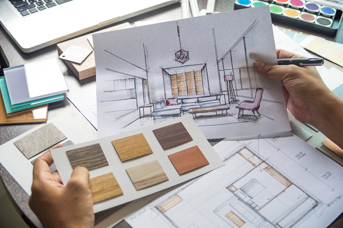
When I first meet with interior design clients and before I start giving any type of advice, I always try to get a sense of their personal style. If I’m able to be physically there, I survey their surroundings, looking for clues so that I might home in on their heart’s desire. This may include photos of family and friends, cherished heirlooms, or souvenirs from a trip – all the colors, shapes, sentiments, and styles with which they have collected and chosen to surround themselves. Such things give me a glimpse into their world and furnish me with a veritable gold mine of information. I can apply the insights glean from such mementos to the conceptualization of a customized motif for each client- designs that will not only look beautiful, but also feel genuinely and uniquely theirs. Once might also do this when designing one’s own room.
To find your style or settle on a theme for your space, look around the room and get a sense of your personal style. Don’t shy away from it. In fact, embrace it—warts and all. Then use it confidently to guide you through the entire design process.
2. CHOOSE A COLOR PALETTE
Once you have settled on your style or theme, you can then move on to selecting a color palette. I usually start in the living room or the main room and work my way up from the floor to the ceiling. It is a good idea to “anchor” the floor with a darker hue and then lighter as I move up vertically to the midrange which are the walls and the furniture in the room. Areas toward the ceiling should be the lightest.
You might even peruse design magazines for inspiration; or do an online search with terms like, say, “living rooms with hardwood floors”. You might search for “rooms with (your favorite) color/theme”. In doing so, you may find a color combination that you like. That will also serve the room well. While doing your research, you will start to notice that many designer rooms that are especially pleasing to the eye usually have a maximum of three main colors. They also exhibit proportions being about 2/3 of a main color, about 1/3 of a secondary color, and a final color used sparingly as an accent.
3. FIND INSPIRATION
Another good way to find a color palette and/or theme is to look for an item to design around. You may already have something in the target room--such as a special pillow, tapestry, rug, vase, logo, or a piece of furniture. You can use any of these things to help you find a palette and/or theme, at your own discretion. For example, if you have a modern Sea Foam Green vase that your grandfather gave you from his trip to Palm Springs, maybe your theme is contemporary modern, and one color for your palette is Sea Foam Green. If your walls are already white, and you can’t or don’t want to paint, then you now have two colors in your palette- Sea Foam green and White. You can stop there for a mono-chromatic look, or you can proceed to add a third color. One way this can be done is by doing an online search for rooms with Sea Foam green and White. One will then be introduced to novel ideas for rooms that will have a third color added to that combination.
4. WORK WITH WHAT YOU HAVE
Most rooms already have a dominant feature with which one must contend. It might be hardwood floors, a brick wall, or a large metal door. Unless it’s a brash, garish color, I tend to consider these features as neutral elements. However, you can use them to determine at least one of the colors in your palette.
I like to keep things looking balanced and fresh. I accomplish this aesthetic effect by juxtaposing dark with light tones or warm with cool colors. You can use this method to tone down the dominant feature. Remember that too much of one thing can make the room look tired and dated. For example, if the wood floor has a dark, warm hue (brown, red, or orange) then maybe try a lighter and cooler color in the rug (green, blue, or purple) to offset it. This is a great way to achieve balance and make things easier on the eyes. Once you have two main colors and a third for accent, you’re well on your way to creating a beautiful room to enjoy for years to come.
#moderndesign #inteririors #home #design #color #palette #modernfurniture #moderniture
Join the convo! Let us know what you think, or any ideas you have! And, for more tips & tricks, design hacks for better living, sign up for our MOD BLOG newsletter.